Alice + Olivia
Alice + Olivia partnered with Studio, to improve its e-commerce platform. We conducted a UX audit and redesign to align the platform with the brand's identity and enhance user experience.
. . .
Homepage
The homepage underwent a redesign to improve navigation and discoverability. Additionally, efforts were made to ensure consistency and responsiveness across platforms.
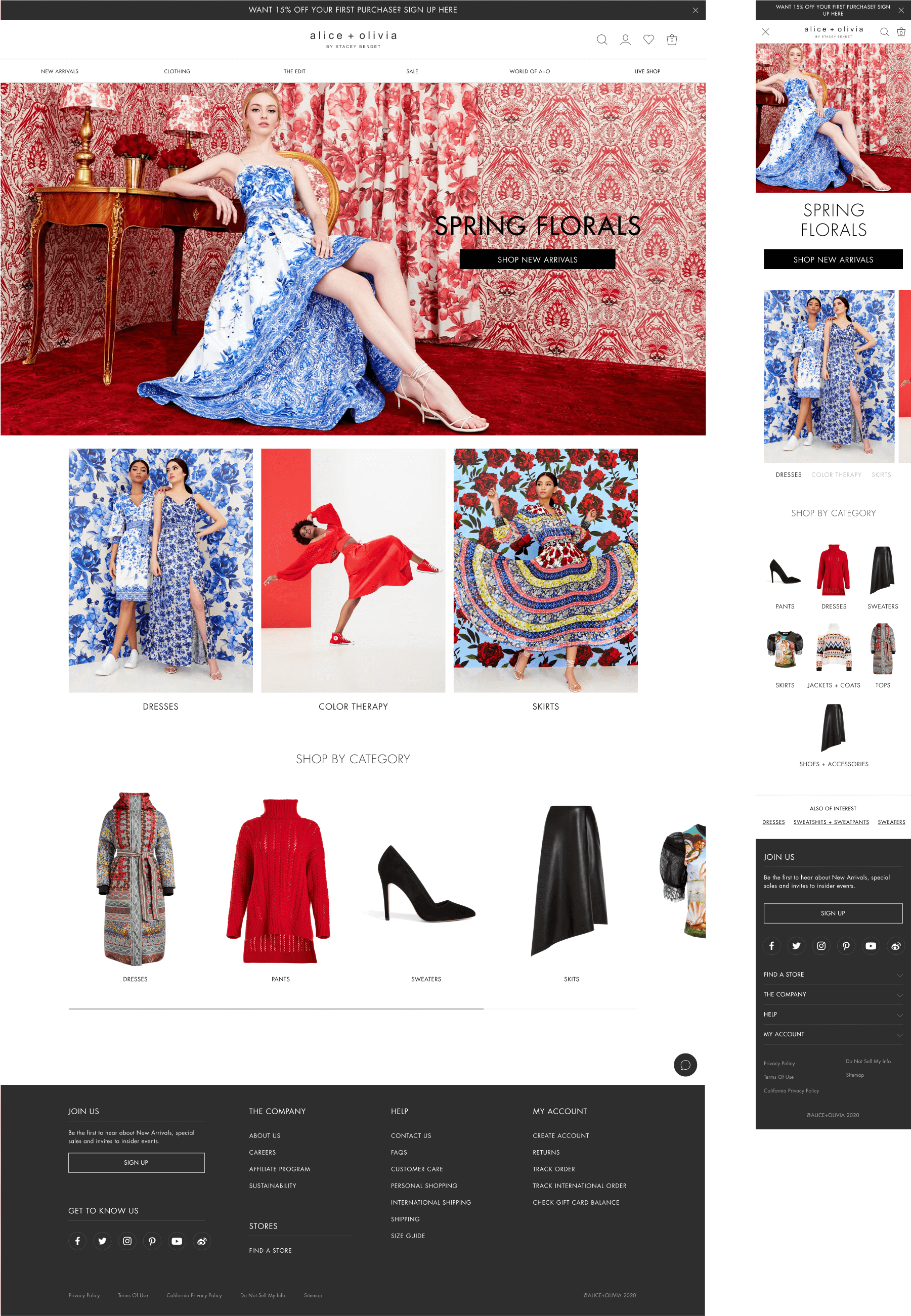
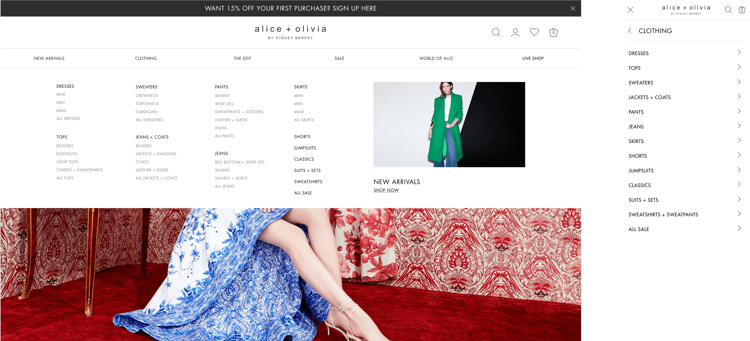
Navigation
Improved to make it easier to find what you need. On desktop, all products are now visible in a dropdown menu, making them easier to discover. On mobile, we switched to a left-to-right navigation for simpler access.
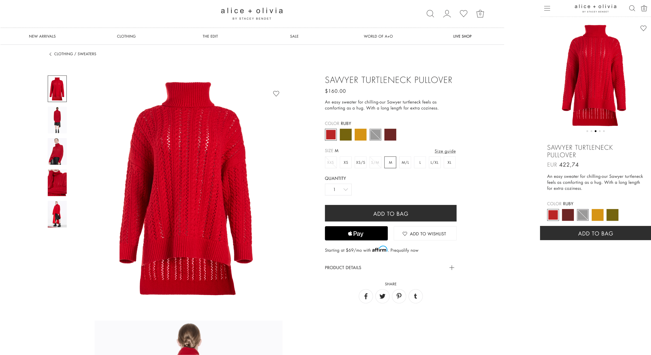
Product Detail
We've revamped our product detail pages to make shopping easier. You'll now find it simpler to select items and see important details clearly. Plus, we've introduced a persistent 'Buy' button on mobile.
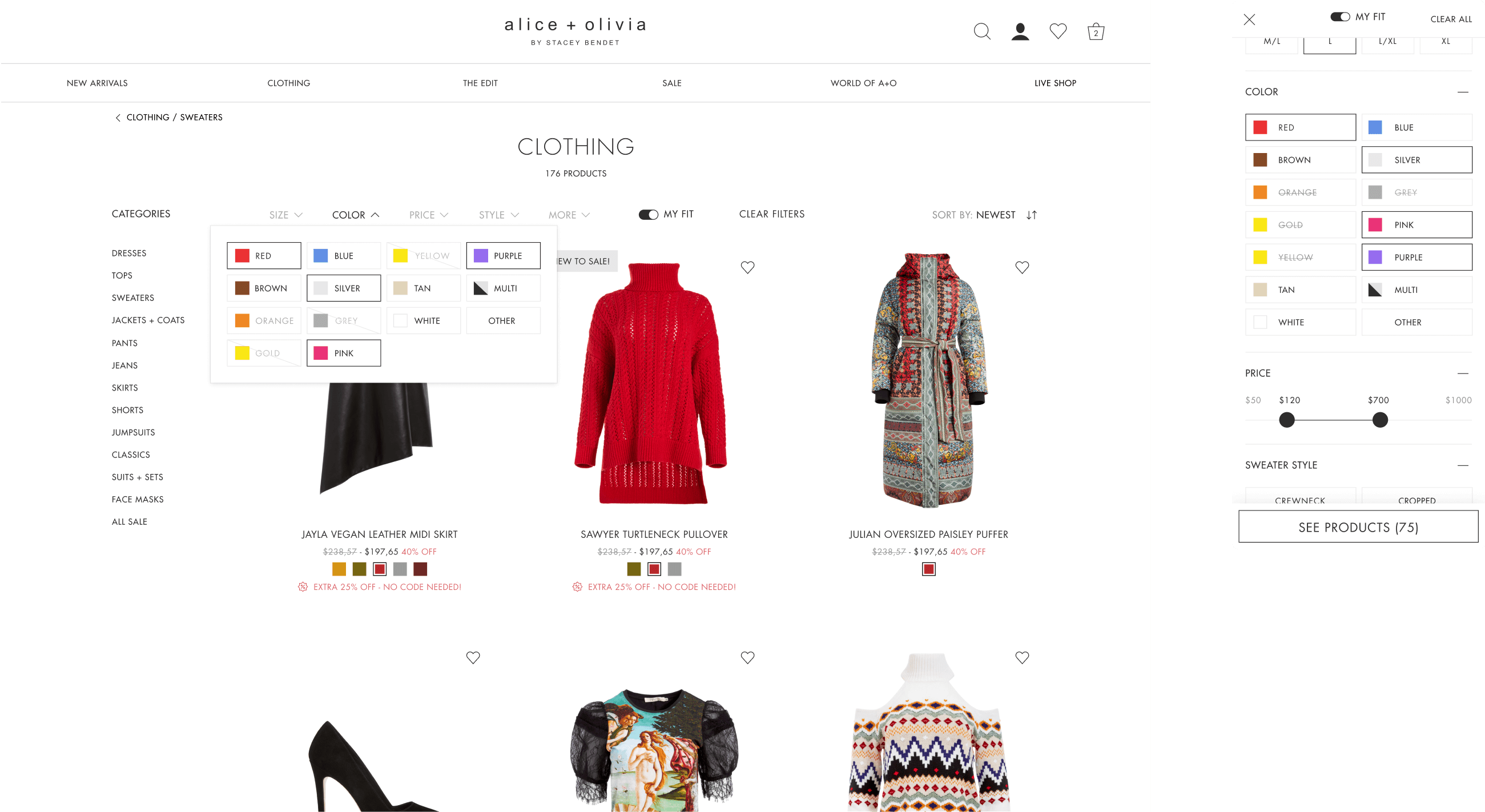
Filters
The My Fit section was upgraded to offer users a personalized shopping experience. Users can now customize preferences and sizes for tailored product recommendations.
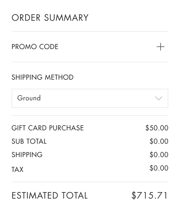
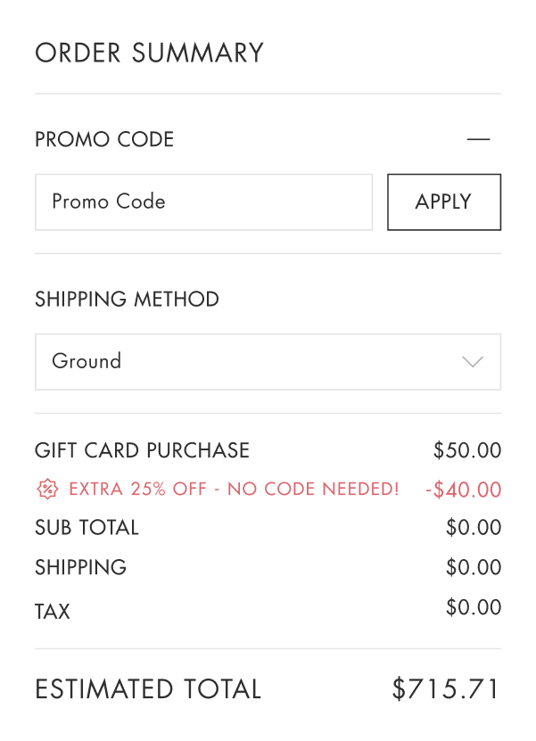
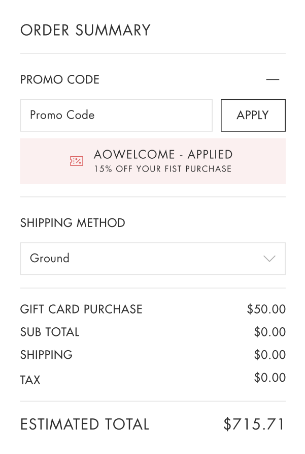
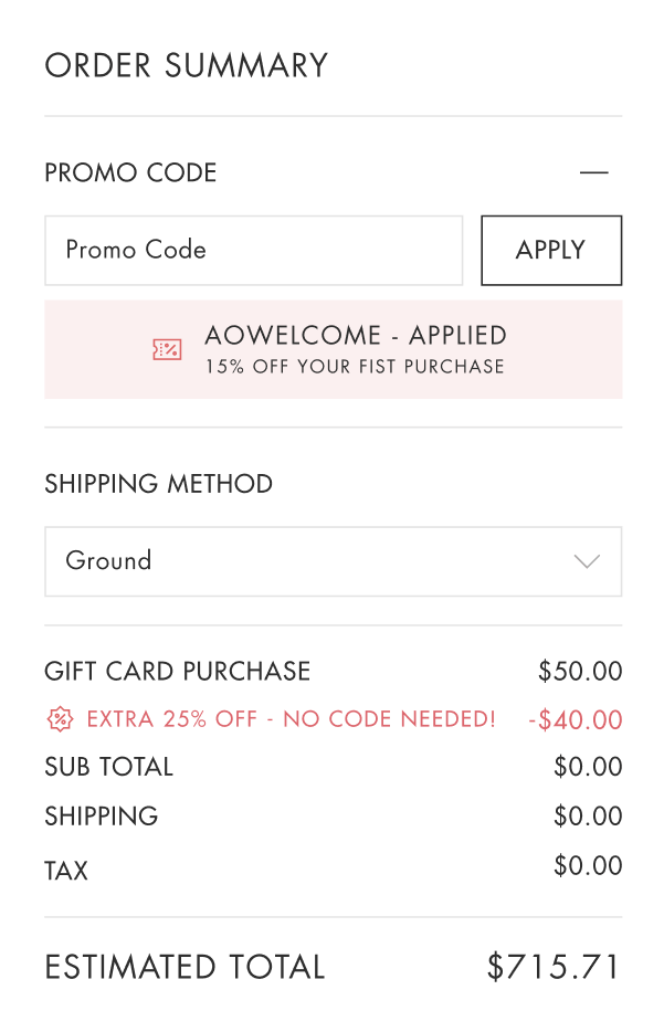
Cart Scenarios
We ensured that every aspect harmonized with the site's design. This included thorough testing on both mobile and desktop devices. Our objective was to maintain a unified and minimalistic shopping experience, ensuring consistency throughout.