Tony Robbins
At Fueled, I led the design for Tony Robbins' Breakthrough app, an immersive and visually rich experience for iOS and Android. The app features his transformative courses and personal development tools, empowering users on their growth journey.
. . .
Initial concepts
From the start, our emphasis was on courses, ensuring seamless navigation. Implementing a zooming feature for course details enhanced immersion, maintaining spatial continuity.
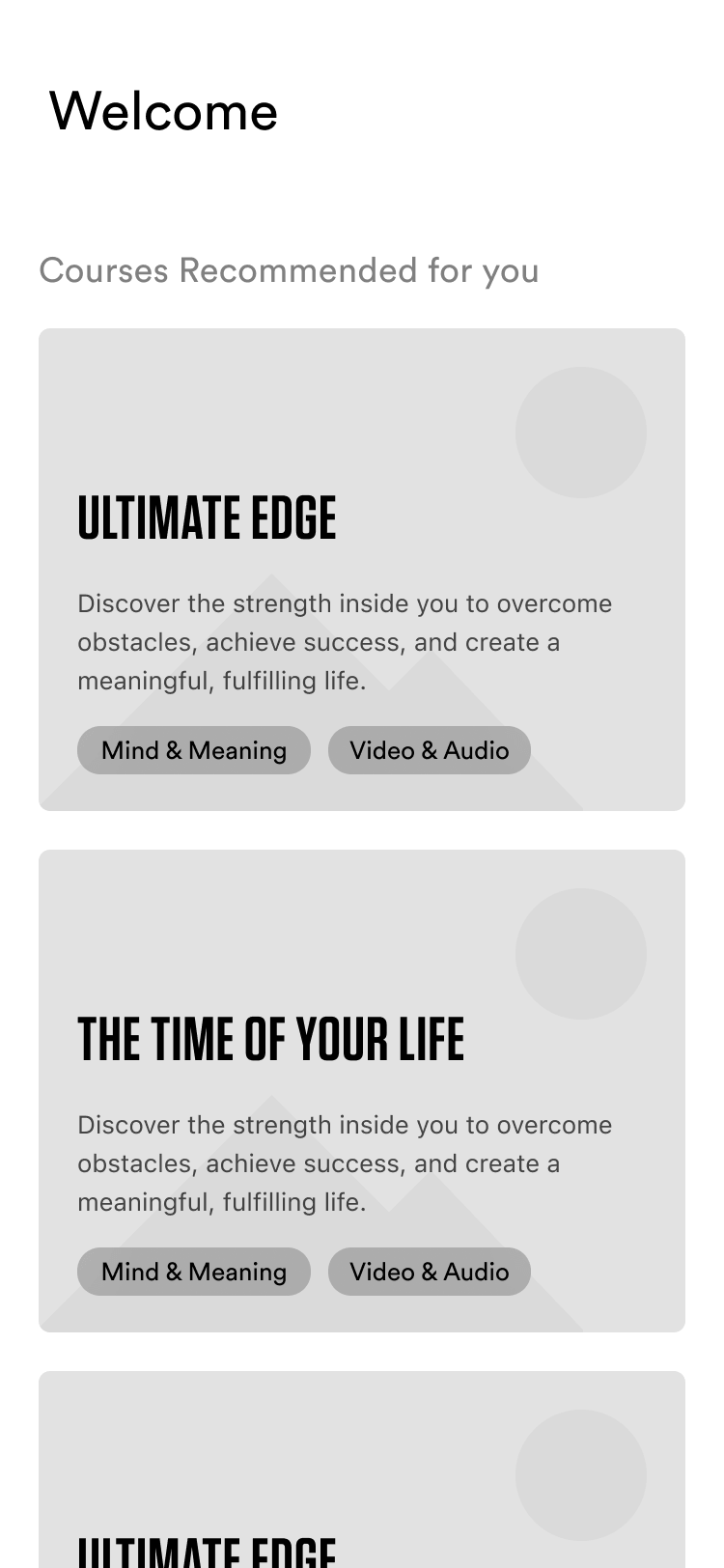
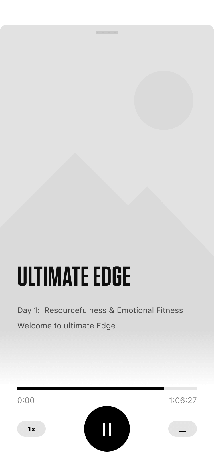
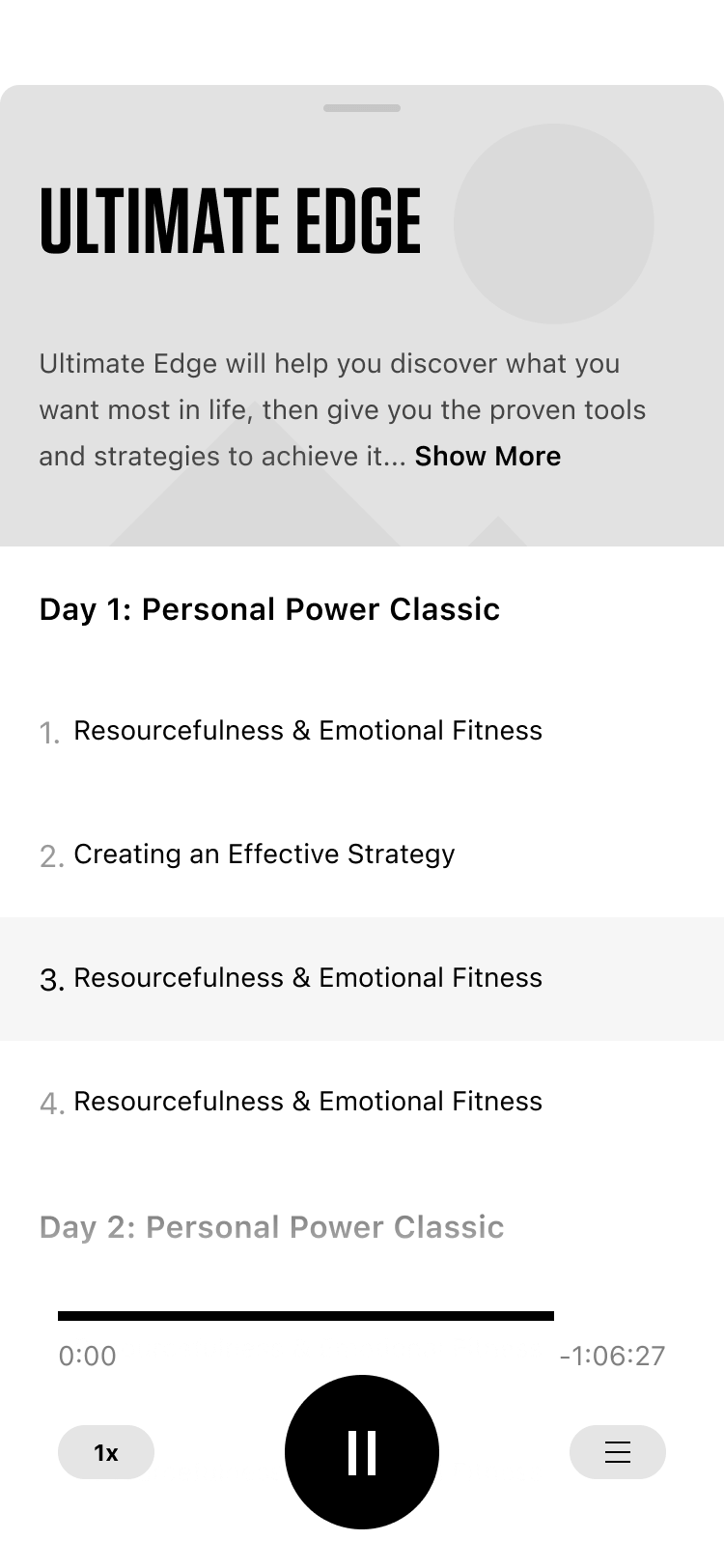
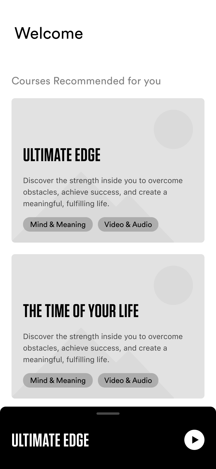
Courses Design and Visuals:
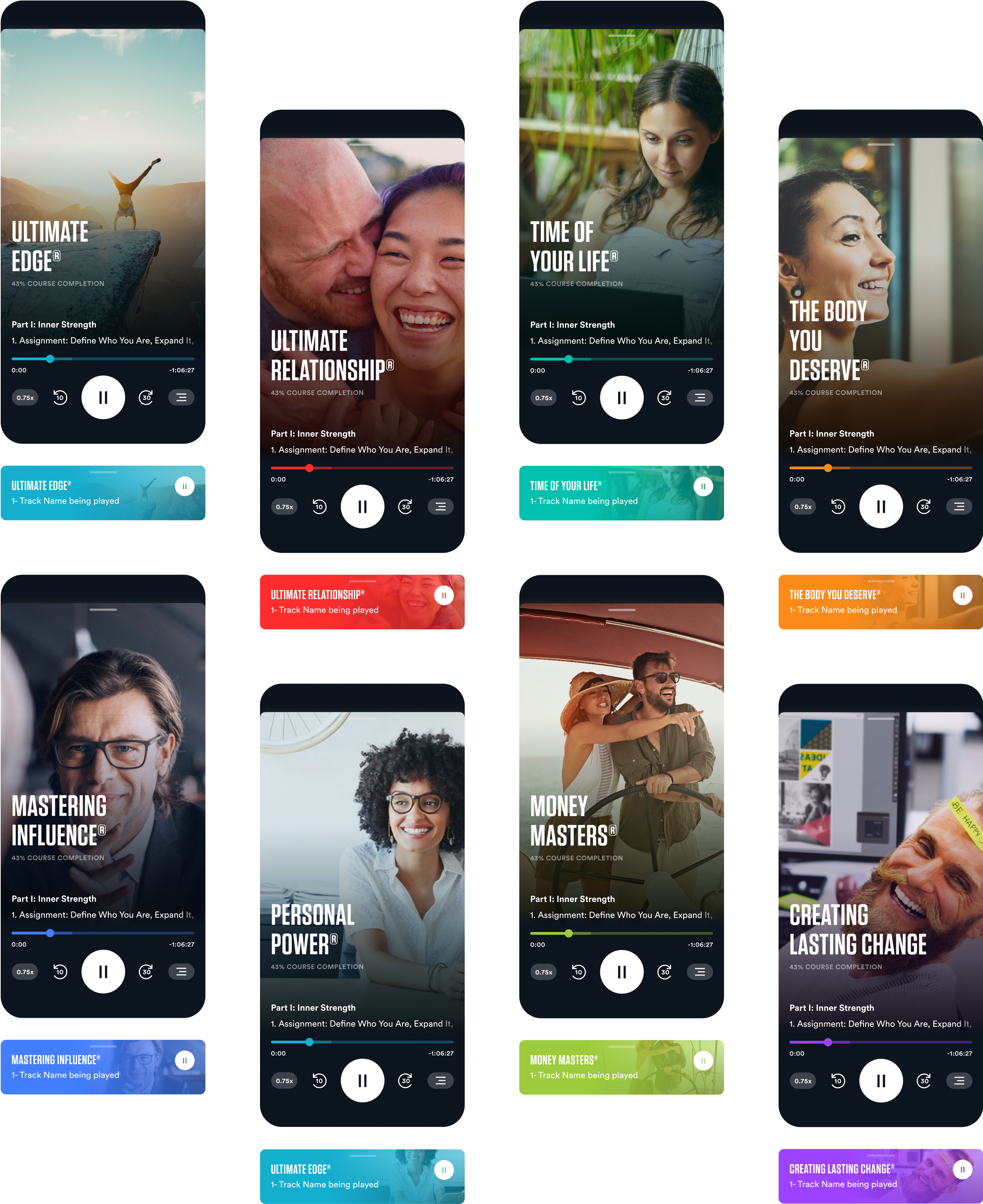
The Breakthrough app's core courses, existing prior to development, posed a challenge: integrating them seamlessly while preserving Tony Robbins' brand for user recognition.

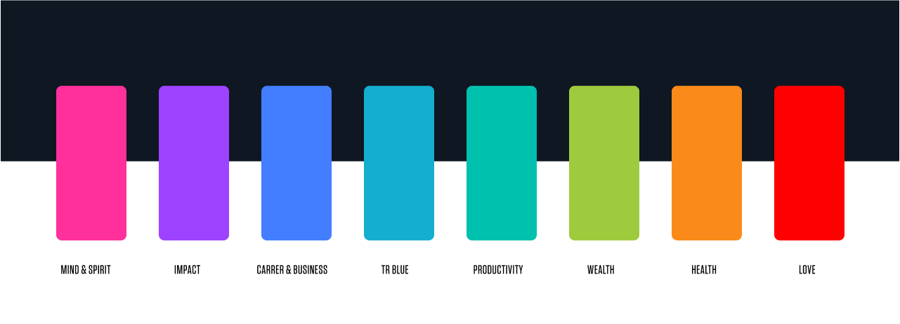
Color System
Refining Breakthrough's color system with precision, we ensured it harmonized with Tony Robbins' brand, enhancing versatility across UI elements and course imagery.
Cross-Platform Design Approach
Designing for both iOS and Android, we balanced platform-specific nuances with consistent design elements, ensuring a unified visual experience and streamlining our workflow across platforms.
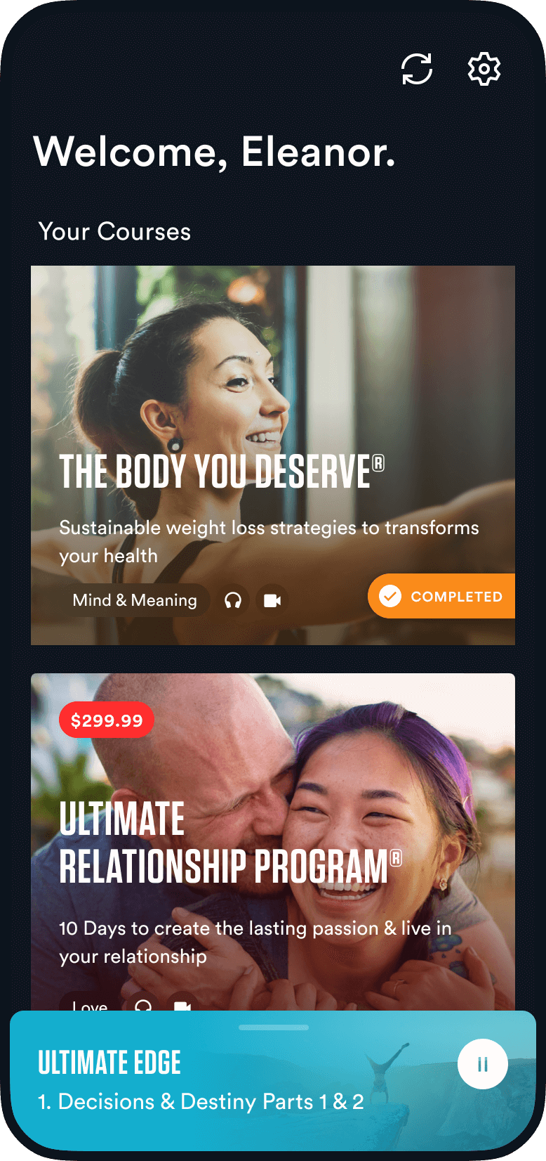
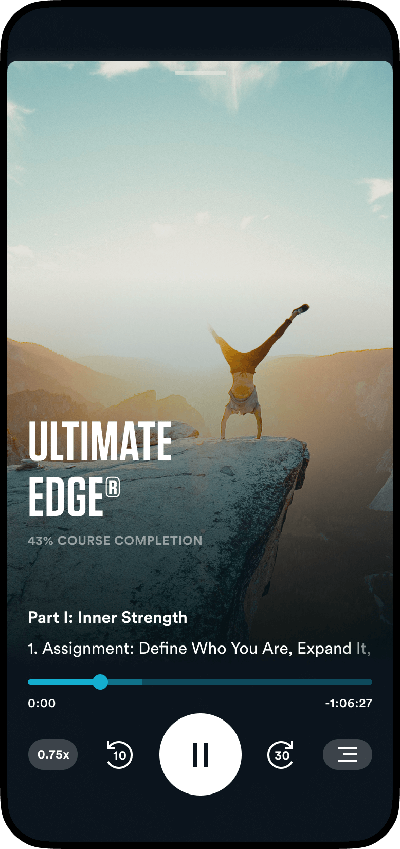
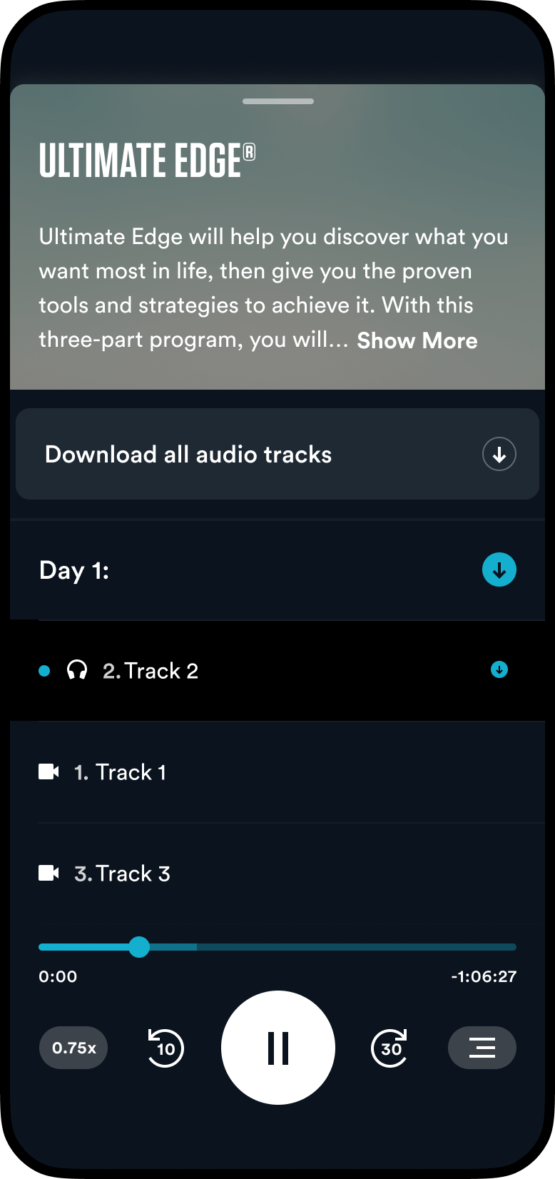
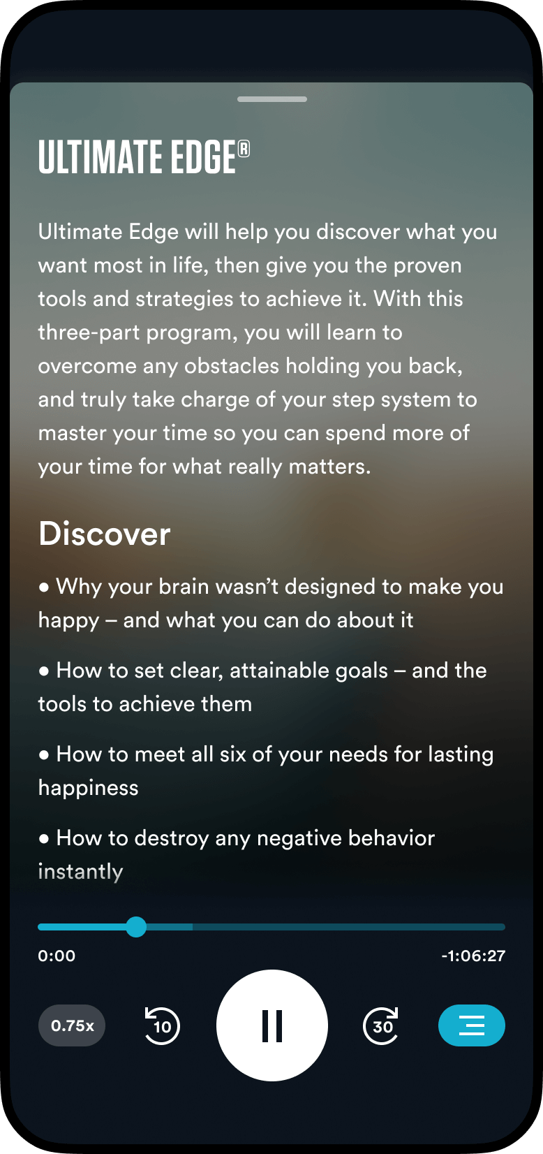
Course covers are key. We added a subtle player that matches each course's accent color for clarity. When minimized, this color contrasts with text and UI elements, while the course cover stays visible.
Motion and Interaction
A spatial understanding of interactions. we worked hard to make Everything feel live and responsive to touch. Continuity ensures smooth transitions, enhancing usability economically.
User Feedback
The Breakthrough app received positive feedback, with an average rating of 4.9 stars from 5.7K ratings on the App Store, making it one of Fueled's most succesfull projects until date.
Acknowledgments
This project was a collaborative effort involving a team of talented individuals during my time at Fueled. Special thanks to those who worked closely with me, particularly Rob Bye for his expertise in product management, and Ivan Korepanov for his meticulous attention to detail in building the UI.